

chaotic-control


About chaotic-control

- Birthday April 19
TruckersMP Information
-
Virtual Trucking Company

Global Cargo
Driver
External Websites
- X (formerly Twitter)
-
World Of Trucks


chaotic-control's Achievements
")


-
I do agree with your sentiment here, however it just doesn't work on TMP. The point I was trying to make is if the same people took locos to the featured zone they would cause massive tailbacks. Although by the looks of things now it's live, that's the least of anyone's worries... Of course there is going to be traffic, I wasn't expecting a free run, but there is already at least a 2 hour queue before you even get to the event zone, which is surely ridiculous. In my experience from the previous Featured Zone and any Real Ops, the majority of people don't adhere to any smart signage, especially when it comes to speed. As with being critical about something I hadn't experienced, see any recent TMP event.... It's all the same.
-
I don't have high hopes for this, unfortunately. The Alps, on Sim 1, is already a mess, either with people driving far too fast for the road itself (the classic mindset of going to a busy area but still needing to do 110km/h, or with all the 'cool kids' hauling locomotives, doing <10km/h, basically blocking. And even with GM's clearly in the area, nothing is done. It is chaos. A featured zone needs an area that is easily driven normally, but is then affected by changes such as lanes closures, smart signage etc, making it a unique experience, rather than slightly modifying an already slow road with some aesthetics. How is adding restrictions to an already restricted area (the game literally tells you commercial trucking is not permitted) going to add fun to an already stale TMP experience?? If I'm going to check out the changes, it will most likely be on Sim 2, with hopefully a more respectful, conscientious group of people. The lack of TMP staff on Sim 2 moving a few custom vehicles, as will be the case on Sim 1, will, I'm sure, not really take anything away from the experience...
-

Special Transport DLC Addition for Truckersmp
chaotic-control replied to Tucker Carson's topic in New
You could always use a lower powered truck with a heavy cargo that is available within base game, or within the Heavy Cargo Pack DLC. As long as you're not massively under the speed limit on a busy route, you'll be fine. Ignore anyone who needs to do 110km/h E.g, parts of the c-d have a limit of 60km/h, you can't be blamed for doing the speed limit -
Please check out my newest ETS2 edit!
-
Why isn't the Duisburg Calais road being rebuilt?
chaotic-control replied to cetu4yx's topic in General Discussion
There's no reason for TMP to re-build it. The road is bad to drive because it is overpopulated. SCS will soon rework the remaining area, which will shift TMP traffic one way or another. Either way, aside from the trolls / ban evaders using a new Steam account every Steam sale, we all have a whole continent to explore. There are so many nice roads to drive, especially within a MMO experience. It's a shame everyone wants to queue, rather than drive. -
Honestly, it's a mystery. Everyone wants to queue, add at least 1 hour to their job time and get trolled by idiot players on the c-d, rather than explore the entire map. There are so many newer areas where the TMP mod would work wonders, i.e multiple IRL players could interact with each other at realistic junctions, etc. But of course TMP just want that 3rd party social media 'wow factor', hence the constant support of the 'busy' c-d road, even if it goes against their entire set of rules.
-
Ask the average TMP player, and I'm sure most would answer the same, cars are a curse on the servers. At best, 99% of car drivers are reckless, e.g, must do 110km/h and weave around traffic on the C-D, and to the extreme, cars are used to troll legitimate truck driving players. So the idea of promoting the use of cars with accessories is mind blowing. I can't see how this will have a positive overall effect for the average player, on a truck sim game. Surely the add-on team's time could have been better spent on other projects to make the overall TMP experience better? (Real Ops 16 was very underwhelming...). Instead of working on a few visual accessories for the most reckless drivers on the servers. Once again a disappointing direction from the upper management of TMP.
-
When is the map going to be updated to include the new Rhine Region?
chaotic-control replied to Sunstrider's topic in Archive
Ahh I see, I didn't pick up on you meaning the live map Yeah that's annoying. -
When is the map going to be updated to include the new Rhine Region?
chaotic-control replied to Sunstrider's topic in Archive
Wait, so what's missing? I was under the impression that when TMP supported 1.50 that included the Rhine rework? Dortmund, Cologne, Düsseldorf and Duisburg all seem updated to me on TMP...? -
Hey, Since TMP supported 1.50, FPS drops / lag / desync, seems to be affecting everyone right now. A way to test it for yourself is to play singleplayer, or even convoy mode, if you have smooth game play, it is TMP's issue. It seems TMP is very 'un-optimised' since supporting 1.50. I also constantly have FPS drops, and my ping is unstable or generally higher than normal. Same goes for numerous people I play the game with. Only thing we can do it wait for TMP to sort it out. As a side note, it seems your ban date maybe coincided with the release of 1.50? You being banned wouldn't effect your connection with TMP once unbanned. Hope this helps!
-
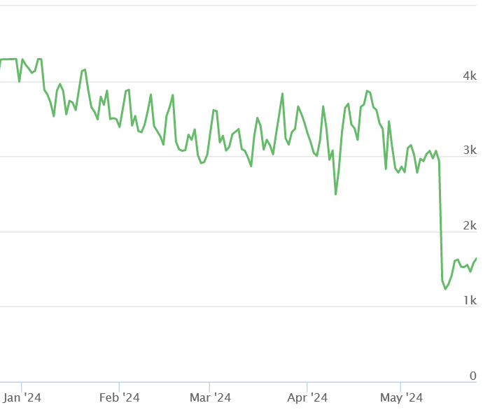
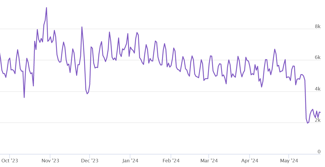
As others have stated, the large decline for ETS2 since 14/05/24 is due to 1.50 being released. Although interestingly, since the start of this year, there has been a slow decline in TMP players. This graph, focusing on ETS2 Simulation 1 numbers, and other statistics are available from https://stats.truckersmp.com/. Another interesting stat is the total amount of users on the TMP servers at one time, which shows a peak at last year's Halloween event, which I believe can be considered one of TMP’s most successful ever events. Compare that to the recent (arguably, most important event / milestone), TMP10 event. Which, following the confusion of the second half of delivering cargo for a personal TMP10 achievement, and only ~60% of the community goal reached for delivering the special cargoes in general, hinting towards a less well managed and communicated event, it again seems interest in TMP is slowly declining. Hopefully TMP gets updated to 1.50 soon. And although it is of course understandable such an update will take time, it is disappointing that there hasn't been any significant communication, stating of any delays or an estimated time frame. Which, if the community that is so important to TMP were to be updated in an appropriate way, would of course stop these kind of questions and doubts.

-
Why don't play on the Simulation 2 server?
chaotic-control replied to Samsunlu TR's topic in Archive
Who want's to play a truck driving simulator game with maniacs flying about the place, and who have no regard or respect to anyone else around them? For me, that is in no way fun in the slightest. -
Confusion about right of way and European roundabout laws
chaotic-control replied to Wariortank07's topic in Archive
Hey, from your video, you had right of way / priority. The player joining the roundabout has the yield / give way 'upside down triangle' signs, just as you did when you entered the roundabout yourself. In terms of lanes, you were correct to enter the roundabout in the left hand lane, and use the inside lane of the roundabout. When you want to exit a roundabout, common practice should be to signal right, after the exit before your exit, and move to the right lane, and then exit. Ultimately, the player driving into you is at fault 100%. -
Hi, if you mean your game seems like it freezes after the ETS2 intro logo, but eventually loads after 5 - 10 minutes, you can try following this guide, and it should fix your problem. If your issue is something else, please try to explain in more detail.