Search the Community
Showing results for tags 'rating'.
-
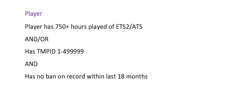
Suggestion Name: Safety rating of players Suggestion Description: Basically your color name would be based out of several factors: 1. Numbers of ban 2. TMPID (OPTIONAL WON'T SAY IT IS A FACTOR) 3. In-game hours This would be optional as not everyone wants to see the ratings of himself or other players. Based on the images under here are some examples: Example player no.1: John has 2 bans within last 12 months and he has 380 hours played on ETS2 and has TMPID of 758124 (JUST EXAMPLE) His category is Orange since he has 2 bans on record Example player no.2: John has 0 bans within last 12 months and he has 248 hours played on ETS2 and he has TMPID of 1700874 (JUST EXAMPLE) His category is Light green since he has enough hours for this category Example player no.3 : John has 4 bans within last 12 months and he has 671 hours played on ETS2 and he has TMPID of 78625 (JUST EXAMPLE) His category is Red as he has 3 or more bans Any example images: Why should it be added?: I think that this would make people care more about their driving to have good looking name and to look safe and good to other people. Also who doesn't want to have a fancy Purple name for others people ONE MORE THING: Anything here can be changed in order to be more fitting and better.
- 1 reply
-
- 6
-

-

-

-
- safety
- safety rating
- (and 7 more)
-
Suggestion Name: Revealing the rating status of our submitted and finished web-reports: Positive or Negative Suggestion Description & Why It Should Be Added: Information from @Anriandor states that the positive / negative results of the reports we submit are only being openly revealed to TMP staff currently. What I am suggesting basically is transparency. Transparency that we as community users get to view the results as well as the reports are submitted through our personal TMPID / Account. Even though a small suggestion, I hope to be able to trust the team more by being able to view said results and that the 0.5 or 0.2 scoring as declared is actually on point. Not trying to be calculative or anything but I feel that having such transparency is important to have trust being given both ways. Any Example Images: Example 1: Either as the picture shows or a line below the status (Green for Positive / Red for Negative) Example 2: GREEN arrow UP or THUMBS UP ICON indicating positive report, and a RED arrow DOWN or THUMBS DOWN ICON representing a negative report result. Colours shown and explained are just for representation purposes, no need for colour implementation. Thank you for your time.


